A business logo consists of more than simply artistic design elements. Your organization’s brand identity becomes visible to customers as they first encounter it when they initially meet your brand. The logo reveals your identity before customers know anything else. Does your current logo repel customers instead of drawing them towards your brand? Your logo color palette directly affects how clients understand your business, which determines their decision to start doing business with you. Wrong logo colour signals to customers may cause your business to lose money unknowingly.
This article thoroughly examines how different colours impact emotional responses and purchasing decisions while modifying brand recognition. It also provides guidance on selecting appropriate logo colours that will benefit your business.
Table of Contents
- The Importance of Logo Colors
- What is the Psychology of Colors?
- How Colors Impact Customer Emotions and Decisions
- Common Mistakes Businesses Make with Logo Color
- How to Choose the Right Colors for Your Logo
- Case Studies
- Conclusion
1. The Importance of Logo Colors
![]()
Your logo functions as a vital element for building brand identification. Customers automatically connect your business with this initial graphical representation that fosters their entire perception of your brand. Studies indicate that the subconscious judgments made about products or services mostly rely on colour attributes exclusively and account for as much as 90% of total first impressions. Your logo’s colours will either create or destroy a customer’s first impression.
Your brand identity suffers if you choose inappropriate colour combinations because customers might get confused and choose to move on. Your customers could develop negative emotions when your health and wellness business’s logo features bold, aggressive red and black colors, which normally create uncomfortable feelings. When businesses choose their colours wisely, they can create feelings of trust, excitement or calmness which encourages customers to make specific buying choices.
2. What is the Psychology of Colors?

Psychology investigates how colors affect human emotional responses, triggering specific behavioural responses. Colours powerfully trigger particular emotions because they possess distinct psychological meanings that make branding and marketing essential elements. For instance:
Throughout human cultures, red symbolism serves to represent both powerful energies alongside passionate romantic feelings along with threatening danger.
When used in design blue creates associations with trustworthiness while conveying a feeling of relaxation and establishing reliability.
When viewed from the human eye, yellow induces both optimistic feelings and alerts people not to worry. It simultaneously embodies happiness alongside sleep alerts.
Through its symbolism, green represents both natural elements and wellness alongside planetary development.
Black stands for luxurious items or powerful elegance while symbolizing sophistication.
By understanding color effect patterns on human perceptions, you can produce a logo that connects to your audience and solidifies your brand identity.
3. How Colors Impact Customer Emotions and Decisions
3.1 Red: Passion or Danger?
The strength of the red colour helps both activate attention and generate intense emotional responses. The colour red appears in food brand logos at Coca-Cola and KFC because it makes consumers hungry and builds rushing sensations. In the healthcare and finance sectors users must handle red carefully since this color has dual meanings that can signal either danger or aggression.
3.2 Blue: Trust and Stability

Blue ranks as an industry-leading branding color because it creates feelings of trust combined with reliability and professional competence. The technology companies Facebook and Twitter along with IBM utilize blue to represent their brands. The relaxed shade of blue generates feelings of security that suits professional companies within the finance and healthcare and technology fields. When using blue tones in branding it works best to combine it with warmer color palettes because blue can sometimes create feelings of coldness or distance from viewers.
3.3 Yellow: Optimism or Caution?

Within brand color schemes, yellow expresses happiness as well as delivers energy and projects optimism. Every time we visit McDonald’s or browse Snapchat, we feel cheerful because they use yellow as an integral branding element. The academic literary concept suggests that yellow delivers messages of caution over warnings to people before matters elevate in seriousness but excessive use often creates overwhelming situations for viewers.
3.4 Green: Growth and Harmony

Green carries the meanings of nature and health along with a symbolism of growth. Eco-friendly and wellness-type brands frequently use green to express their messages about sustainability and balance. For example, Starbucks employs greenery to produce feelings of relaxation and foster an environmental connection within its brand image. News about green color generally delivers a positive message though presentations that combine green with complementary hues help avoid dull effects.
3.5 Black: Luxury or Intimidation

Black symbol sophistication alongside elegance and power in the fashion world. Through their clothing and accessories Chanel and Gucci demonstrate black’s power to establish luxury brands. The widespread use of black in design may feel oppressive to some, while proper coordination will produce elegant results.
3.6 White: Simplicity and Purity

White symbolizes straightforwardness combined with spaced cleanliness as well as ethical purity. Rostering for minimalist brands, technology companies, and industries in healthcare represents its most common use. Apple uses white in its logo because it symbolizes clean innovation while representing the company’s simple design position. A drawback of excessive white usage leads to spaces that seem both cold and unwelcoming.
3.7 Purple: Creativity and Royalty
Purple is a color that represents elegance, creative genius, and imaginative thinking. Many luxury beauty products alongside design brands use purple color to express elegance and one-of-a-kind appeal. The application of purple color can be beneficial for high-end niche or creative business brand identities yet too much use creates an unnecessary dramatic effect or appeals solely to niche audiences.
4. Common Mistakes Businesses Make with Logo Colors
4.1 Ignoring Your Target Audience
Every color tone fails to connect with particular audiences. Your audience preferences shift according to age since younger people choose vibrant tones and older people choose classic tones. Your demographic audience’s preferences must guide your selection of logo colors.
4.2 Overusing Bright Colors
A lot of bright colors used together could ultimately damage your logo’s professional appearance because it overpowers the viewer’s attention. Use an even color selection which showcases your brand identity while allowing it to remain professional.
4.3 Using Too Many Colors
Too many colors in a logo make viewers’ understanding of your brand message harder and devalue its meaning. Logos that achieve success commonly display two or three colors since these limits help keep branding messages direct and easy to read.
4.4 Ignoring Cultural Meanings of Colors
The meaning of colors varies among different cultural societies. White symbolism signals purity across Western cultural spaces however, many Asian traditions use it to convey mourning emotions. Your global business operations must ensure logo colors do not offend without purpose or create confusion among your worldwide audience.
5. How to Choose the Right Colors for Your Logo
5.1 Aligning Colors with Your Brand Identity
Your logo colors should embody your brand identity, including personal attributes and core values. Brands characterized by energy exhibit red or orange tones as part of their graphic identity,y while brands seeking trust work work best with blue or green elements.
5.2 Researching Competitor Logos
Study your market competitors’ logos for guidance on what branding works for your business field. Select colors which make your brand distinctive without breaking conventions in your sector.
5.3 Testing Colors with Your Audience
You should test your logo’s design with your target audience to study their color reactions before making final decisions. Research through surveys and focus groups enables you to understand how your logo appears to its audience.
6. Case Studies: Brands That Got It Right
6.1 McDonald’s
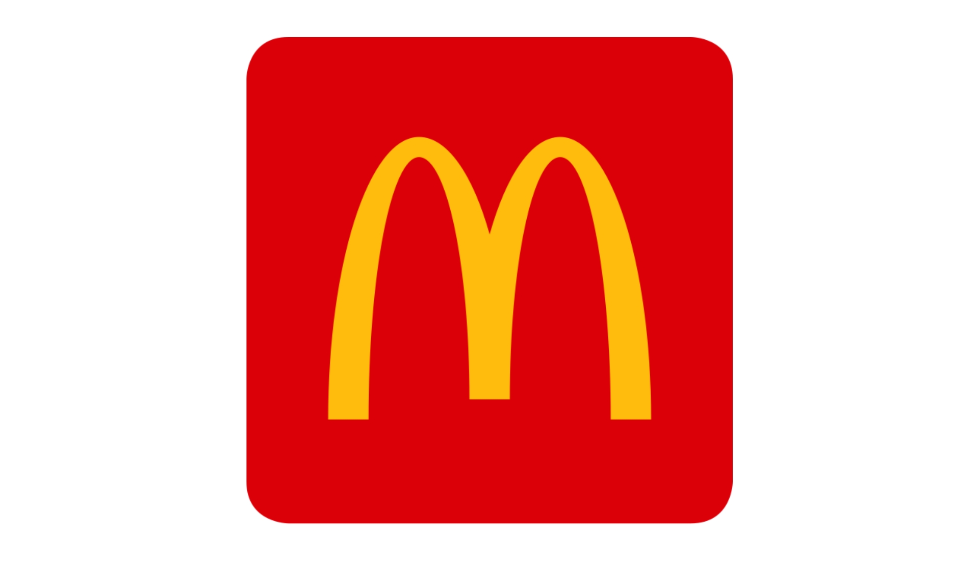
The food industry color scheme McDonald’s adopts consists of red and yellow to establish consumer hunger and positive feelings. Fast-food brands which want happy family involvement and vivid environments choose bright red and yellow color schemes.
6.2 Apple
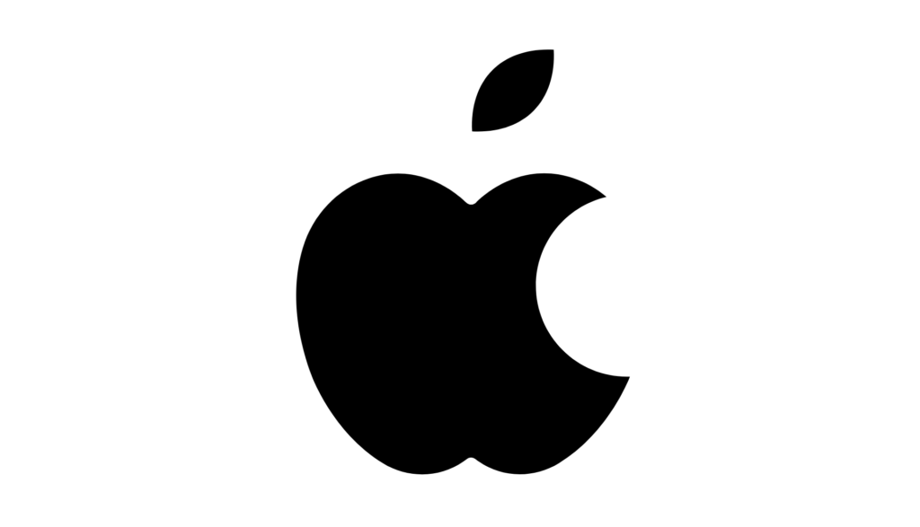
In its black-and-white design Apple’s branding embodies simplicity together with sophistication alongside innovation. The straightforward logo design precisely matches Apple’s innovative technology leadership role.
6.3 Starbucks
Starbucks uses a green logo color image that represents growth health, and nature because this matches both their sustainability goals and offers customers places to relax.
7. Conclusion:
Every color selection in your logo represents a deliberate business tool that guides how customers understand your brand while boosting your commercial outcomes. The appropriate choice of colors within your brand’s design will help build trust with audiences and fuel their excitement or create feelings of calm but improper color selection will drive away your audience and blur your communications.
Your decision to comprehend color psychology combined with brand representation and consumer color preferences will allow you to produce logo colors that build brand affinity and audience engagement. Your business success depends on making smart color choices because poor decisions in this area will clearly diminish your brand expansion.