
Colors are not just pretty, they shape how people feel, remember, and choose brands. For Brand Color Trends 2025, the shift is toward palettes that combine warmth, authenticity, and emotional resonance. Neutrals such as Mocha Mousse, dark browns, clay colours, true blue, and mustard are also gaining popularity due to the fact that they are not light or bright but feel down-to-earth and reliable, yet provide a visual appeal.
Recent research indicates that an organic and earthy colour palette is one of the most desired in contemporary branding. Blue remains a favourite colour, with the most trusted colours being used to balance modernity and stability, with expressive colour combinations like warm or neutral mixes or bold colour pairs being used. The colour scheme is what most consumers see first, and that is why trending logo colors 2025 is a considerable step that any business should take in order to reach its audience.
1. The Psychology of Color in Branding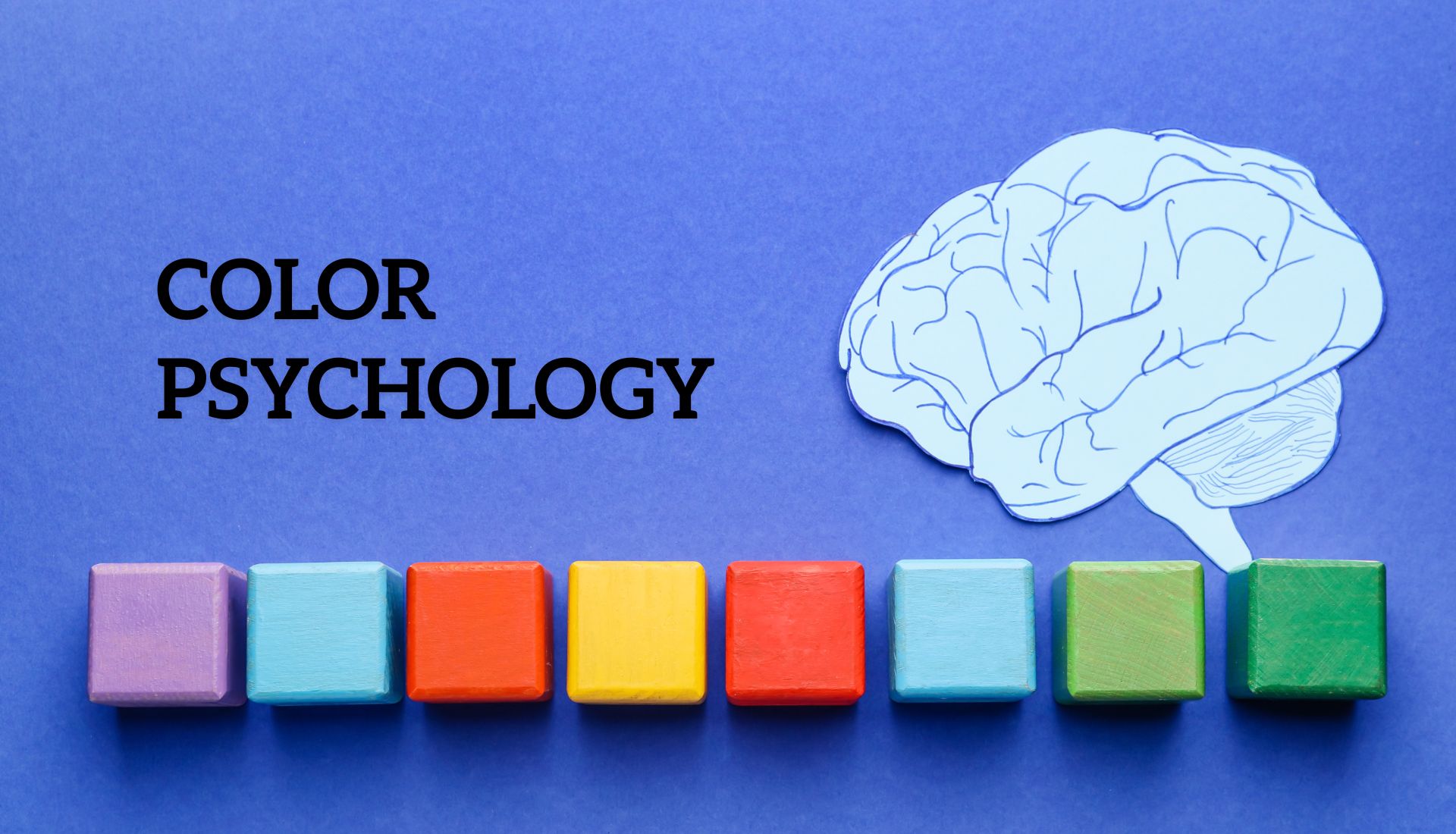
Why Consumers Respond Emotionally to Colors
Colour affects people’s emotions before they start reading anything. Research indicates that as much as 90 per cent of snap judgments of products occur just based on colour. Cultural associations, personal experiences, and intuitive visual signals all result in emotional responses. Indicatively, warm colours like red or orange are more likely to inspire urgency or excitement, whereas cool colours like blue and green usually invoke a sense of calmness and trust. This relationship is what made colour psychology in branding one of the hottest issues for designers and marketers.
The Role of Trust and Recognition in Brand Colors
Colour consistency in logos, websites, packaging and marketing creates recognition. Studies have shown that brand recognition can increase by 80% with the regular use of a signature palette. Colours that convey reliability, stability, and trustworthiness are commonly preferred by the brands that want to convey these attributes, which is why guides on How to Choose the Right Colors for Your Brand continue to dominate the current branding discourse. The decisions have a direct connection to brand identity colour trends, with companies specifically targeting colours that bear their values and bring about a long-term devotion.
2. Popular Brand Colors in 2025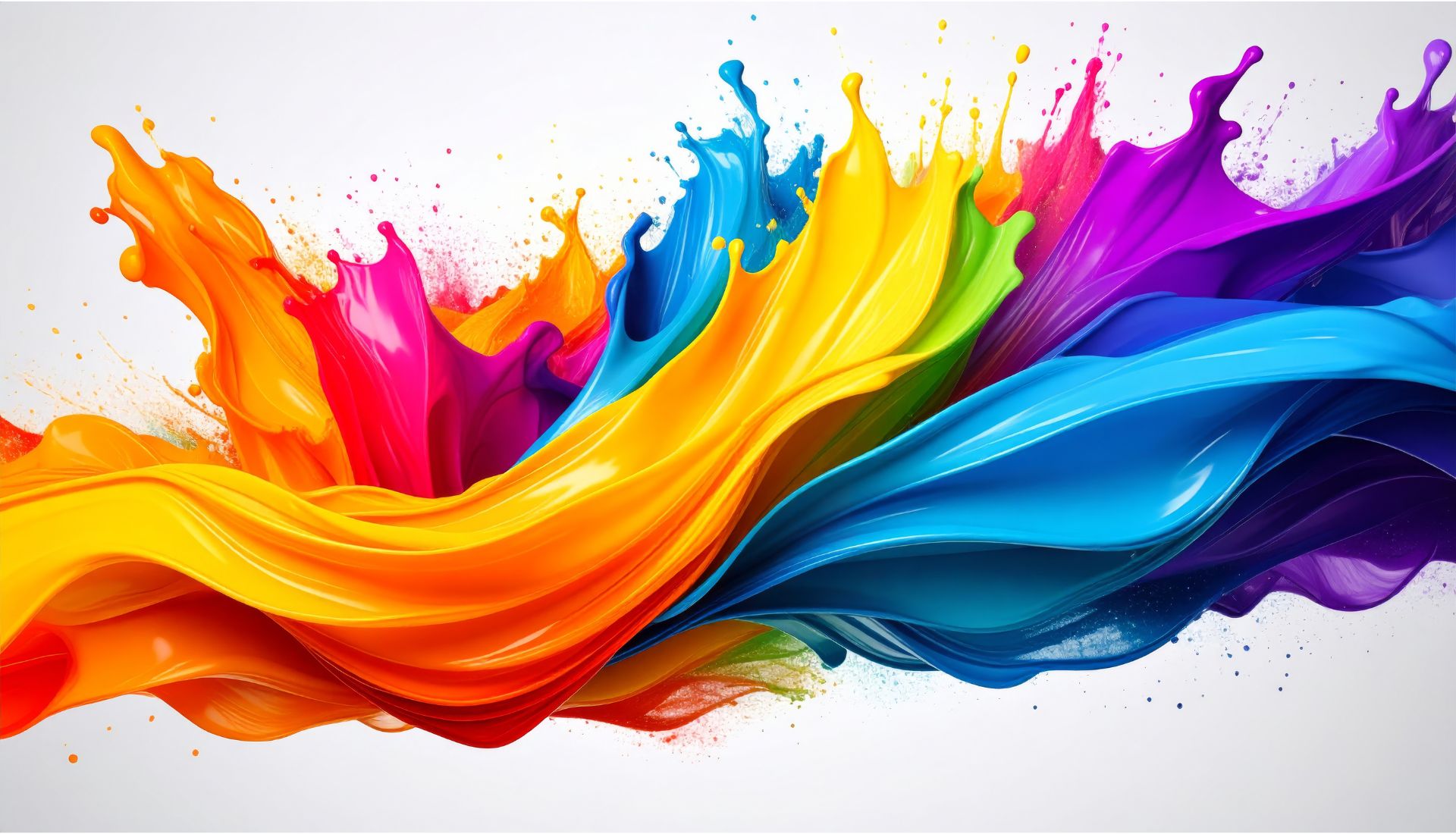
Certain colours are ubiquitous this year in that they react to what people desire: comfort, clarity, and personality.
Mocha Mousse is the Pantone colour the world has to have in 2025. Its warm brown colour unites richness, indulgence and grounded softness. It is frequently combined with neutrals or toned-down colours to express both glamour and familiarity.
Other colours are also becoming popular, along with Mocha Mousse. Red is coming back as an effective accent, applied with care so as not to overpower attention. The colours, such as clay, wood, mustard and aquamarine, are a bit warmer, yet more contrasting. Dark colours like true blue and midnight give an impression of seriousness and calmness. These trends are influencing most modern brand colors 2025 and look like a combination of traditional and innovation.
Trends are also being determined by colour pairing. Gold and navy are elegant, rose and cherry red are dramatic, and aqua and sand are open and modern. Experimenters with these palettes are preempting the best brand colors 2025 and demonstrating that the choice of colour is one of the most important indicators of brand personality.
3. Color Palettes and Combinations Leading the Year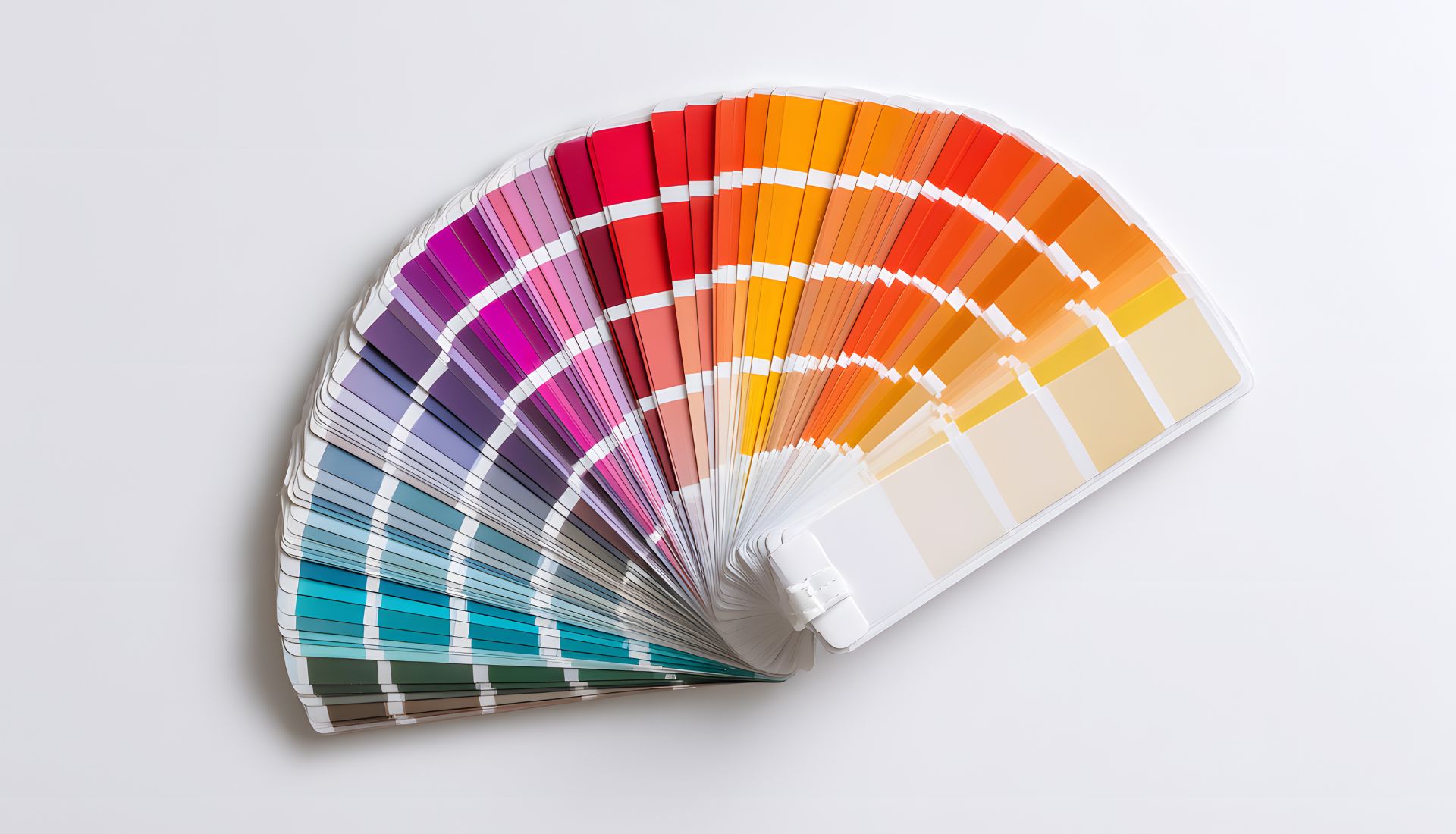
In 2025, colour palettes are based on harmony, contrast and emotional resonance. In their selections of combinations, brands are opting to narrate stories, trigger trust and be visually distinct.
Earthy Neutrals and Grounding Palettes
Branding with neutral colours like clay, wood, cream and dull beige is common, and this is created to give warmth, stability and permanence. Darker colours, such as Mocha Mousse, tend to be combined with other natural colours to make it look more homely and natural. These palettes tie effectively to the earth tone palettes 2025, which is an emerging popular option among lifestyle and eco-friendly brands.
Bright Accents and Bold Color Duos
Accent colours such as burning red or vibrant yellow are also being introduced to the otherwise neutral palettes in order to create attention without overpowering the design. Contrasting colours (gold with navy or mustard with midnight blue, etc.) are particularly trendy.These creative color palettes for logos help brands look energetic and modern while keeping balance.
Ethereal and Soft Shades
Light pastels, sky blue and aquamarine are also on trend since they are cosy and inviting. Most designers are mixing them with more subdued earth colours to create a contrast that is both refreshing and not too aggressive, and they are best suited to wellness, beauty, and tech-centred brands.
Vintage and Retro Combinations
The use of burnt orange, mustard, avocado green, and dull gold is returning a retro feel to packaging and lifestyle branding. These palettes are nostalgic and relevant at the same time, making businesses perennial.
Contrasting and Monochromatic Styles
Monochromatic palettes, palettes made of a combination of shades of one colour, are increasingly becoming popular since they appear unified but offer depth as well. Combinations of warm and cool colours, such as clay and muted blue or wood with some aquamarine overtones, are also being used to create a balance of energy and calm.
4. Industry-Specific Color Directions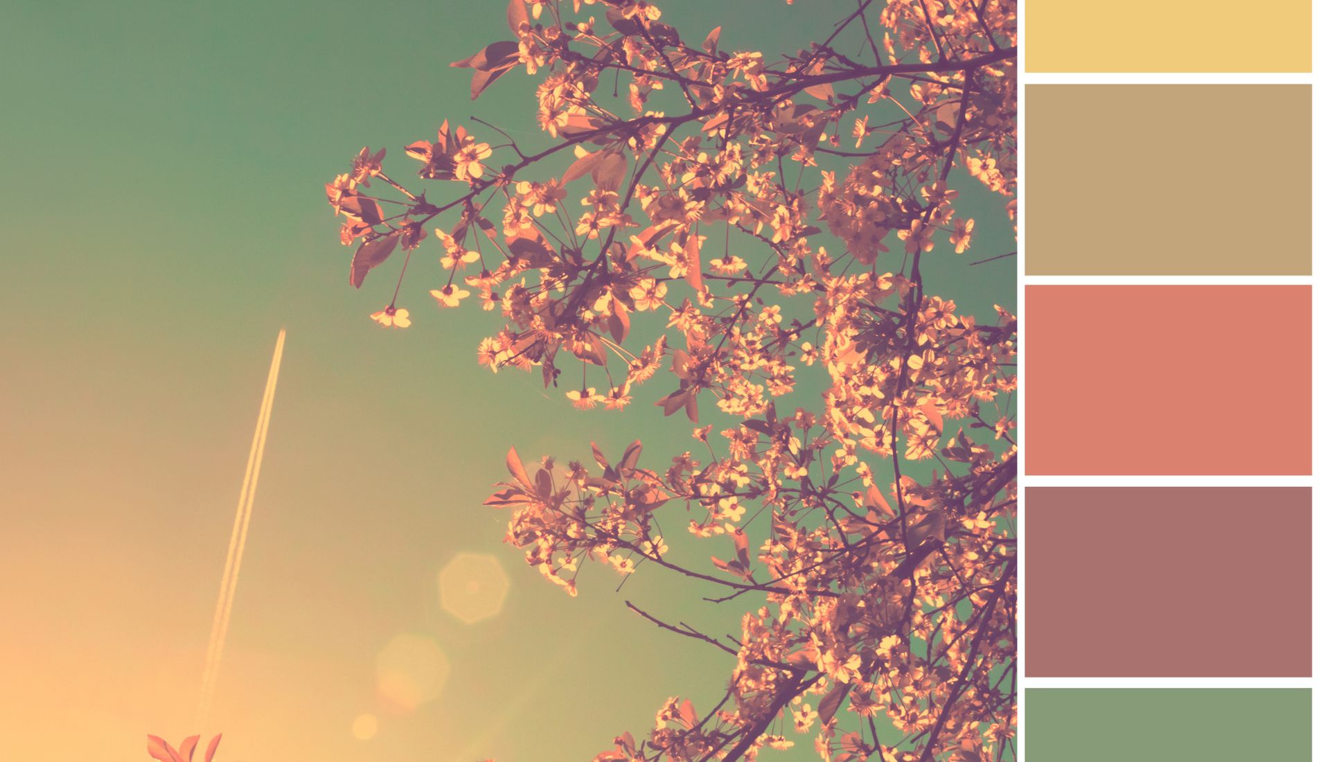
In 2025, colour in different industries is being adopted differently, depending on consumer expectations and emotional appeal.
Tech, Health, and Wellness
Technology and wellness brands tend to use relaxing colours like ethereal blues, greenery, sage greens, and subdued neutrals. These colours convey trust, safety, and technology and are desired in automotive mechanic business cards and in tech-related branding where confidence is vital.
Fashion and Lifestyle
Fashion, retail and lifestyle brands are gravitating towards big accents. Firm and natural colours such as clay, wood and mustard are contrasted with vivid reds and metallic elements to establish a catching presence. These palettes appeal to younger consumers seeking fresh and creative designs, as well as more general trends of mechanical business cards design, as the visual effect is important.
eCommerce and Marketing
Brands are putting contrast first in online retail. Call to action, product photos, and promotional graphics are highlighted using bright yellows, bright reds, and lively accents. These vibrant palettes will cause attention and clicking, and keep a balanced base palette consistent.
Home Decor and Interiors
Pantone is particularly powerful with its Mocha Mousse in interior and decor. Sensations of comfort and classic sophistication are created with this warm brown colour, as well as light creams and natural neutrals. These tones resonate with customers as they make them feel secure and inviting in their homes.
5. Design Approaches Defining 2025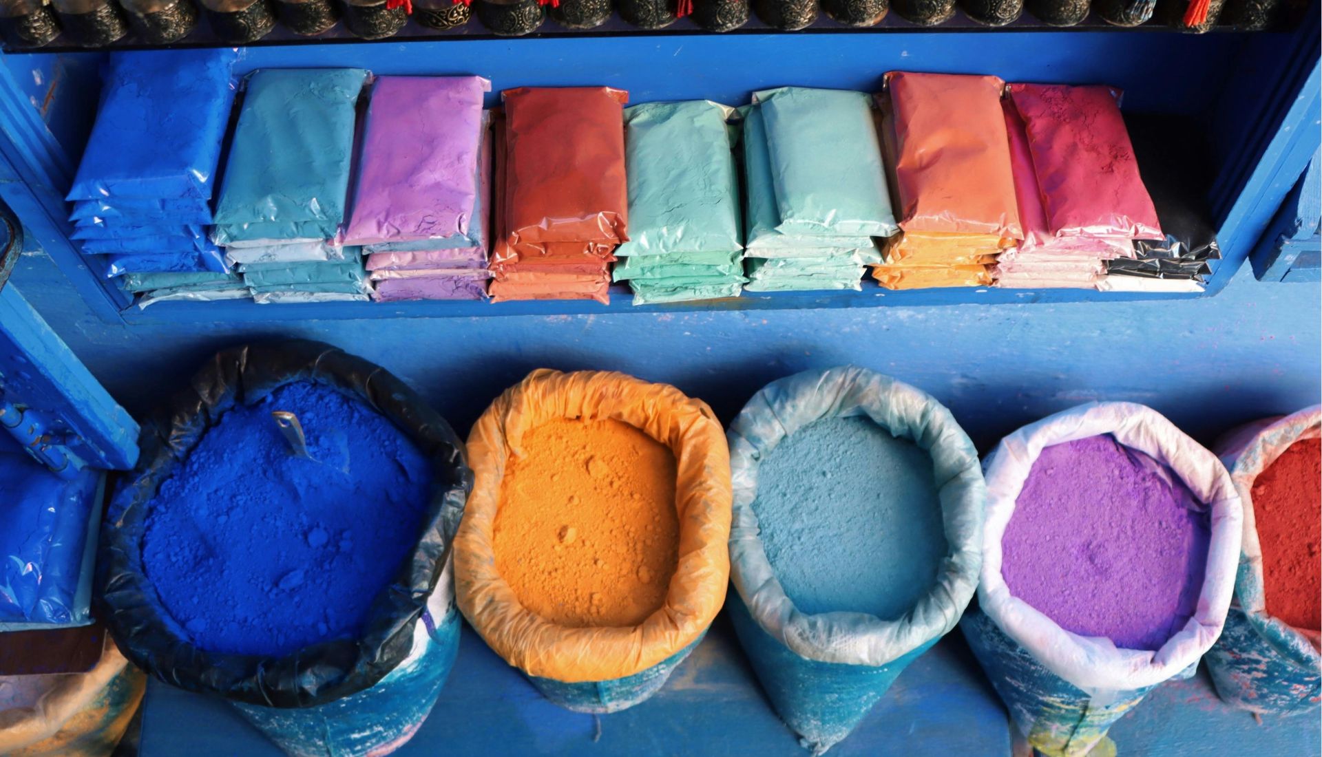
Design in 2025 is evolving. Brands are merging minimalism with bold elements, texture with flat colour, tradition with innovation, instead of having a single, set style.
Bold Minimalism
Minimalism is being re-conceived as bold and dramatic. Designs contain fewer graphics but focus on them with heavy bold colour options, heavy font and minimal layouts. Backgrounds are kept neutral, but contrasting or bright accents are used to add liveliness and not complexity. The style has an echo in technological and lifestyle branding, where the most important things are clarity and impact.
Warm Minimalism and Muted Accents
Minimalism, cool, sterile, is wearing out. The warmer tones, natural textures, and dulled accent colours are on the rise. Smooth geometry, dulled coral, dusty teal, and beige colours are present with minimal features to make simple but welcoming designs. These strategies emphasize the significance of a minimalist brand colour palette in 2025 since it is elegant yet emotionally engaging.
Metallic and Textured Effects
Silver, chrome, and warmer gold are also coming back as accent finishes. Flat designs are made three-dimensionally using textured grains, overprinted visuals, and tactile materials. These facts contribute to the feeling of sophistication and quality without saturating the total appearance.
AI Enhanced and Adaptive Design
Artificial intelligence products enable designers to experiment with palettes, create variations and scale designs across platforms. Shifting palettes, or living palettes, can be adopted and changed according to the situation. It is aimed at flexible systems that will appear equally robust on mobile, packaging, or print.
Maximalism in Balance
Minimalism is not only changing, but maximalism is not going away either. Layered illustrations, graphic dual colour treatments, and pattern mixing are done sparingly with clean space and harmonized palettes. This approach reflects the rise of bold brand color combinations, where expression is encouraged but remains balanced.
6. The Emotional Impact of Color Choices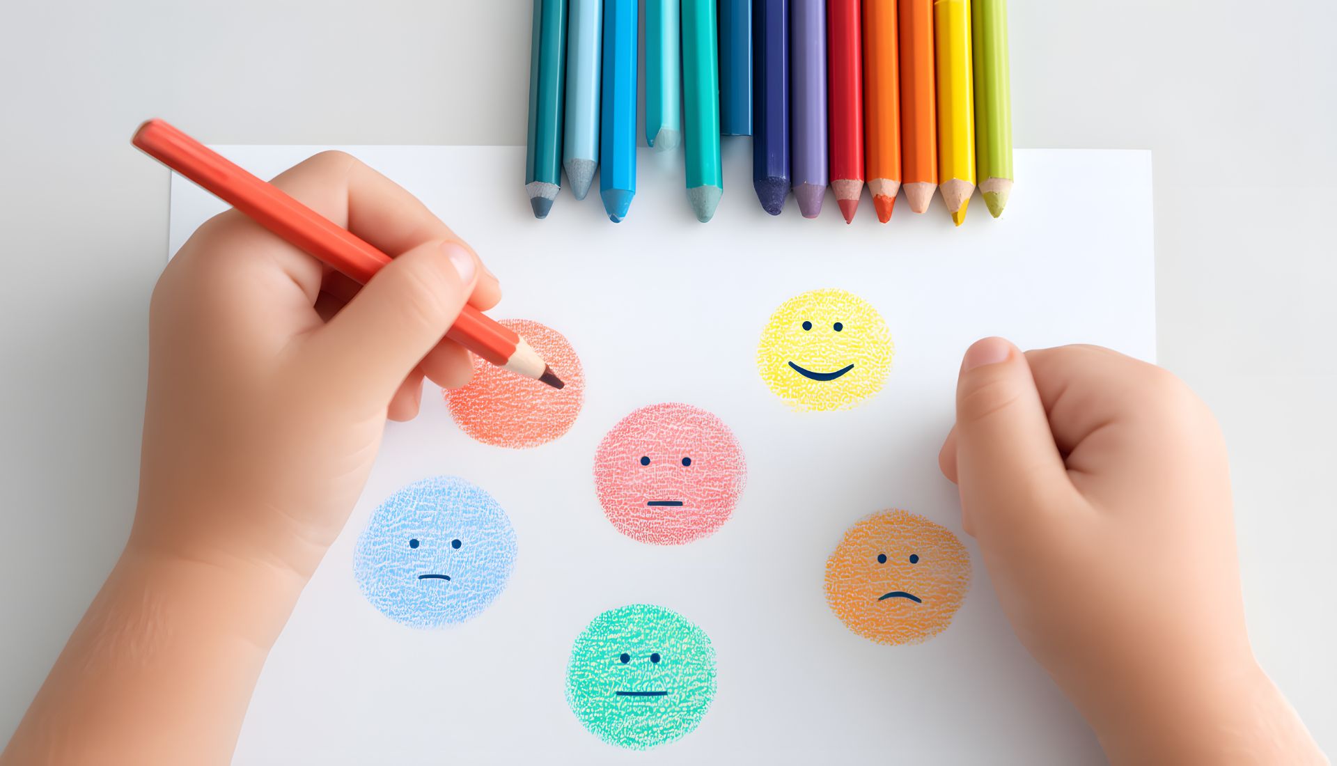
Colour links brands with emotion, which is why companies spend lots of money on a colour palette that impacts customers.
Building Loyalty with Color
Research indicates that brand recognition can be boosted by close to 80 per cent with the use of particular colours on a regular basis. Blue commonly indicates trust, which is why it is a popular colour of banks and tech brands. Red and mustard are warm tones and are associated with excitement and energy, spurring quicker decisions. This is the reason why most companies use logo colors that build trust to enhance long-term relationships with customers.
Emotional Palettes for Connection
Colours define the way customers perceive a brand. Green and earth colours depict stability and harmony with nature, whereas jewel colours imply prestige and luxury. Brands are increasingly using emotional color palettes for brands to build more emotional resonance, either through serenity in the case of wellness businesses or spectacularity in the case of fashion labels.
7. Future Outlook Beyond 2025
The trends in colours are changing with culture, technology and international values. It is already possible to see some directions ahead.
Sustainable and Eco Palettes
Eco-friendly companies are gravitating towards low-key greens, soft brows and light neutrals, which are environmentally responsible. These colour palettes are well-known as authentic and are bound to take over packaging and lifestyle branding. They resonate with the increased nationalism of warm neutral brand colors in developing a relatable and trustworthy identity.
Cultural and Global Influence
Global palettes are determined by cultural trends. Bright reds, aquamarines, and mustard demonstrate the optimism and diversity in the international markets. Meanwhile, luxury brands are becoming darker in jewel colours to indicate wealth. Such a combination demonstrates that trending brand colors 2025 will be flexible in terms of cross-industrial use and remain emotionally charged.
Key Takeaways
- Brand Color Trends 2025 show the way palette forms identity, recognition, and trust.
- Mocha Mousse, Clay, mustard and true blue are the dominant colours since they strike a balance between comfort and modernity.
- Bold accents, earth tones, and adaptive palettes are setting design trends in industries.
- The idea of emotional colour psychology stays in focus, and companies use palettes to create trust and values.
- Even the future of colour after 2025 will be defined by sustainability and cultural diversity.
Conclusion
Colours do not just serve as decoration but are among the most effective in branding. With decisions made by psychology and trending shades and adaptive palettes, Brand Color Trends 2025 demonstrate the extent to which colours impact customer trust, emotions, and even loyalty. With the correct palettes, the businesses can be distinguished, express their beliefs, and establish a sustainable presence in the competitive environment.